Frequency Distribution | Tables, Types & Examples
A frequency distribution describes the number of observations for each possible value of a variable. Frequency distributions are depicted using graphs and frequency tables.
What is a frequency distribution?
The frequency of a value is the number of times it occurs in a dataset. A frequency distribution is the pattern of frequencies of a variable. It’s the number of times each possible value of a variable occurs in a dataset.
Types of frequency distributions
There are four types of frequency distributions:
- Ungrouped frequency distributions: The number of observations of each value of a variable.
- You can use this type of frequency distribution for categorical variables.
- Grouped frequency distributions: The number of observations of each class interval of a variable. Class intervals are ordered groupings of a variable’s values.
- You can use this type of frequency distribution for quantitative variables.
- Relative frequency distributions: The proportion of observations of each value or class interval of a variable.
- You can use this type of frequency distribution for any type of variable when you’re more interested in comparing frequencies than the actual number of observations.
- Cumulative frequency distributions: The sum of the frequencies less than or equal to each value or class interval of a variable.
- You can use this type of frequency distribution for ordinal or quantitative variables when you want to understand how often observations fall below certain values.
Here's why students love Scribbr's proofreading services
How to make a frequency table
Frequency distributions are often displayed using frequency tables. A frequency table is an effective way to summarize or organize a dataset. It’s usually composed of two columns:
- The values or class intervals
- Their frequencies
The method for making a frequency table differs between the four types of frequency distributions. You can follow the guides below or use software such as Excel, SPSS, or R to make a frequency table.
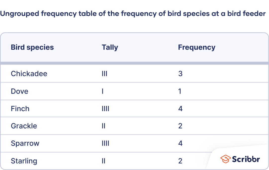
How to make an ungrouped frequency table
- Create a table with two columns and as many rows as there are values of the variable. Label the first column using the variable name and label the second column “Frequency.” Enter the values in the first column.
- For ordinal variables, the values should be ordered from smallest to largest in the table rows.
- For nominal variables, the values can be in any order in the table. You may wish to order them alphabetically or in some other logical order.
- Count the frequencies. The frequencies are the number of times each value occurs. Enter the frequencies in the second column of the table beside their corresponding values.
- Especially if your dataset is large, it may help to count the frequencies by tallying. Add a third column called “Tally.” As you read the observations, make a tick mark in the appropriate row of the tally column for each observation. Count the tally marks to determine the frequency.
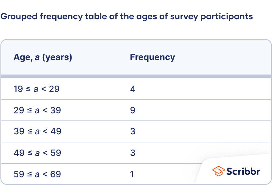
How to make a grouped frequency table
- Divide the variable into class intervals. Below is one method to divide a variable into class intervals. Different methods will give different answers, but there’s no agreement on the best method to calculate class intervals.
- Calculate the range. Subtract the lowest value in the dataset from the highest.
- Decide the class interval width. There are no firm rules on how to choose the width, but the following formula is a rule of thumb:

You can round this value to a whole number or a number that’s convenient to add (such as a multiple of 10).
- Calculate the class intervals. Each interval is defined by a lower limit and upper limit. Observations in a class interval are greater than or equal to the lower limit and less than the upper limit:

The lower limit of the first interval is the lowest value in the dataset. Add the class interval width to find the upper limit of the first interval and the lower limit of the second variable. Keep adding the interval width to calculate more class intervals until you exceed the highest value.
- Create a table with two columns and as many rows as there are class intervals. Label the first column using the variable name and label the second column “Frequency.” Enter the class intervals in the first column.
- Count the frequencies. The frequencies are the number of observations in each class interval. You can count by tallying if you find it helpful. Enter the frequencies in the second column of the table beside their corresponding class intervals.


| 52, 34, 32, 29, 63, 40, 46, 54, 36, 36, 24, 19, 45, 20, 28, 29, 38, 33, 49, 37 |


Round the class interval width to 10.
The class intervals are 19 ≤ a < 29, 29 ≤ a < 39, 39 ≤ a < 49, 49 ≤ a < 59, and 59 ≤ a < 69.
How to make a relative frequency table
- Create an ungrouped or grouped frequency table.
- Add a third column to the table for the relative frequencies. To calculate the relative frequencies, divide each frequency by the sample size. The sample size is the sum of the frequencies.
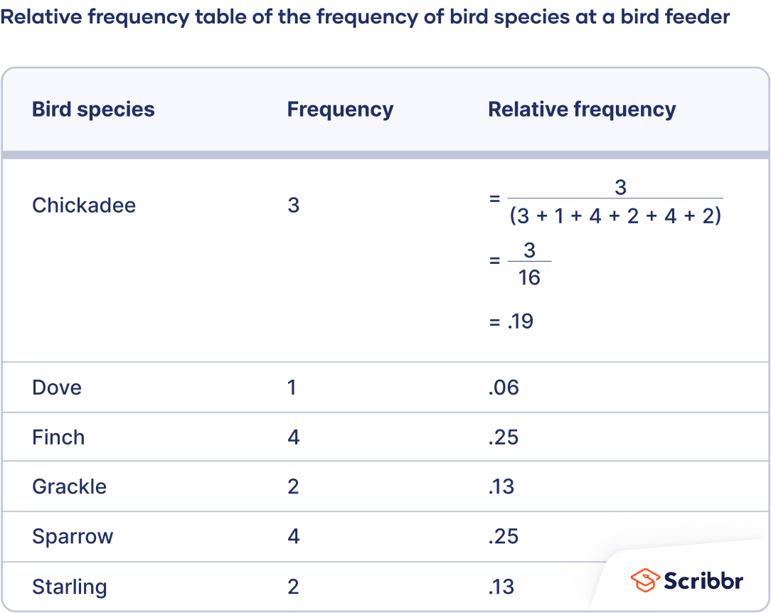
From this table, the gardener can make observations, such as that 19% of the bird feeder visits were from chickadees and 25% were from finches.
How to make a cumulative frequency table
- Create an ungrouped or grouped frequency table for an ordinal or quantitative variable. Cumulative frequencies don’t make sense for nominal variables because the values have no order—one value isn’t more than or less than another value.
- Add a third column to the table for the cumulative frequencies. The cumulative frequency is the number of observations less than or equal to a certain value or class interval. To calculate the relative frequencies, add each frequency to the frequencies in the previous rows.
- Optional: If you want to calculate the cumulative relative frequency, add another column and divide each cumulative frequency by the sample size.
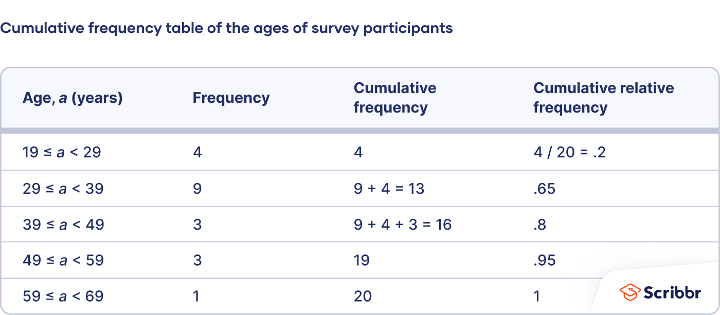
From this table, the sociologist can make observations such as 13 respondents (65%) were under 39 years old, and 16 respondents (80%) were under 49 years old.
How to graph a frequency distribution
Pie charts, bar charts, and histograms are all ways of graphing frequency distributions. The best choice depends on the type of variable and what you’re trying to communicate.
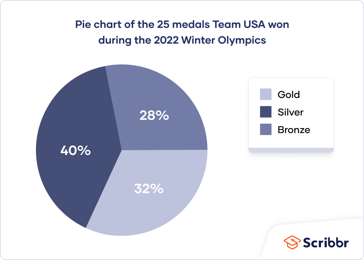
Pie chart
A pie chart is a graph that shows the relative frequency distribution of a nominal variable.
A pie chart is a circle that’s divided into one slice for each value. The size of the slices shows their relative frequency.
This type of graph can be a good choice when you want to emphasize that one variable is especially frequent or infrequent, or you want to present the overall composition of a variable.
A disadvantage of pie charts is that it’s difficult to see small differences between frequencies. As a result, it’s also not a good option if you want to compare the frequencies of different values.
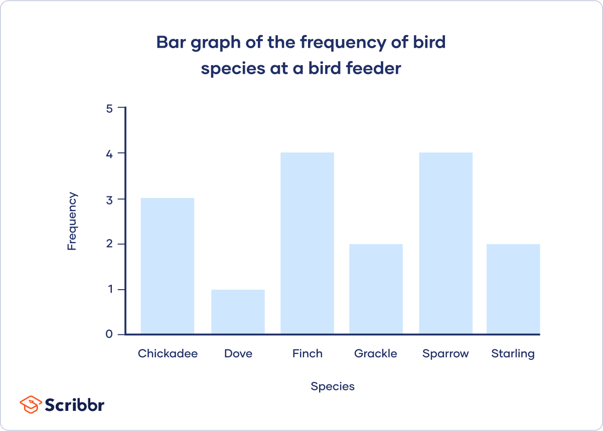
Bar chart
A bar chart is a graph that shows the frequency or relative frequency distribution of a categorical variable (nominal or ordinal).
The y-axis of the bars shows the frequencies or relative frequencies, and the x-axis shows the values. Each value is represented by a bar, and the length or height of the bar shows the frequency of the value.
A bar chart is a good choice when you want to compare the frequencies of different values. It’s much easier to compare the heights of bars than the angles of pie chart slices.
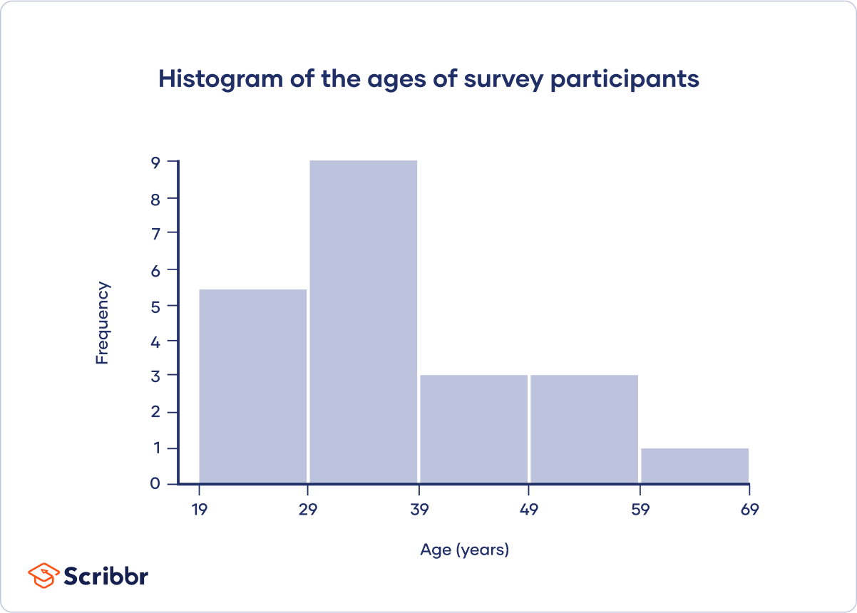
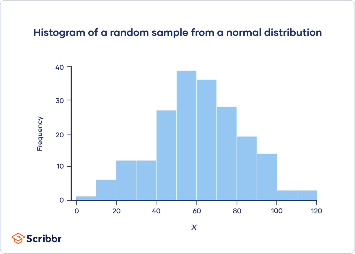
Histogram
A histogram is a graph that shows the frequency or relative frequency distribution of a quantitative variable. It looks similar to a bar chart.
The continuous variable is grouped into interval classes, just like a grouped frequency table. The y-axis of the bars shows the frequencies or relative frequencies, and the x-axis shows the interval classes. Each interval class is represented by a bar, and the height of the bar shows the frequency or relative frequency of the interval class.
Although bar charts and histograms are similar, there are important differences:
| Bar chart | Histogram | |
|---|---|---|
| Type of variable | Categorical | Quantitative |
| Value grouping | Ungrouped (values) | Grouped (interval classes) |
| Bar spacing | Can be a space between bars | Never a space between bars |
| Bar order | Can be in any order | Can only be ordered from lowest to highest |
A histogram is an effective visual summary of several important characteristics of a variable. At a glance, you can see a variable’s central tendency and variability, as well as what probability distribution it appears to follow, such as a normal, Poisson, or uniform distribution.
Other interesting articles
If you want to know more about statistics, methodology, or research bias, make sure to check out some of our other articles with explanations and examples.
Statistics
Methodology
Here's why students love Scribbr's proofreading services
Frequently asked questions about frequency distributions
Cite this Scribbr article
If you want to cite this source, you can copy and paste the citation or click the “Cite this Scribbr article” button to automatically add the citation to our free Citation Generator.
Turney, S. (2023, June 21). Frequency Distribution | Tables, Types & Examples. Scribbr. Retrieved July 8, 2026, from https://www.scribbr.com/statistics/frequency-distributions/