ANOVA in R | A Complete Step-by-Step Guide with Examples
ANOVA is a statistical test for estimating how a quantitative dependent variable changes according to the levels of one or more categorical independent variables. ANOVA tests whether there is a difference in means of the groups at each level of the independent variable.
The null hypothesis (H0) of the ANOVA is no difference in means, and the alternative hypothesis (Ha) is that the means are different from one another.
In this guide, we will walk you through the process of a one-way ANOVA (one independent variable) and a two-way ANOVA (two independent variables).
Our sample dataset contains observations from an imaginary study of the effects of fertilizer type and planting density on crop yield.
We will also include examples of how to perform and interpret a two-way ANOVA with an interaction term, and an ANOVA with a blocking variable.
Table of contents
Getting started in R
If you haven’t used R before, start by downloading R and R Studio. Once you have both of these programs downloaded, open R Studio and click on File > New File > R Script.
Now you can copy and paste the code from the rest of this example into your script. To run the code, highlight the lines you want to run and click on the Run button on the top right of the text editor (or press ctrl + enter on the keyboard).
Install and load the packages
First, install the packages you will need for the analysis (this only needs to be done once):
install.packages(c("ggplot2", "ggpubr", "tidyverse", "broom", "AICcmodavg"))Then load these packages into your R environment (do this every time you restart the R program):
library(ggplot2)

library(ggpubr)

library(tidyverse)

library(broom)

library(AICcmodavg)
Step 1: Load the data into R
Note that this data was generated for this example, it’s not from a real experiment.
We will use the same dataset for all of our examples in this walkthrough. The only difference between the different analyses is how many independent variables we include and in what combination we include them.
It is common for factors to be read as quantitative variables when importing a dataset into R. To avoid this, you can use the read.csv() command to read in the data, specifying within the command whether each of the variables should be quantitative (“numeric”) or categorical (“factor”).
Use the following code, replacing the path/to/your/file text with the actual path to your file:
crop.data <- read.csv("path/to/your/file/crop.data.csv", header = TRUE, colClasses = c("factor", "factor", "factor", "numeric"))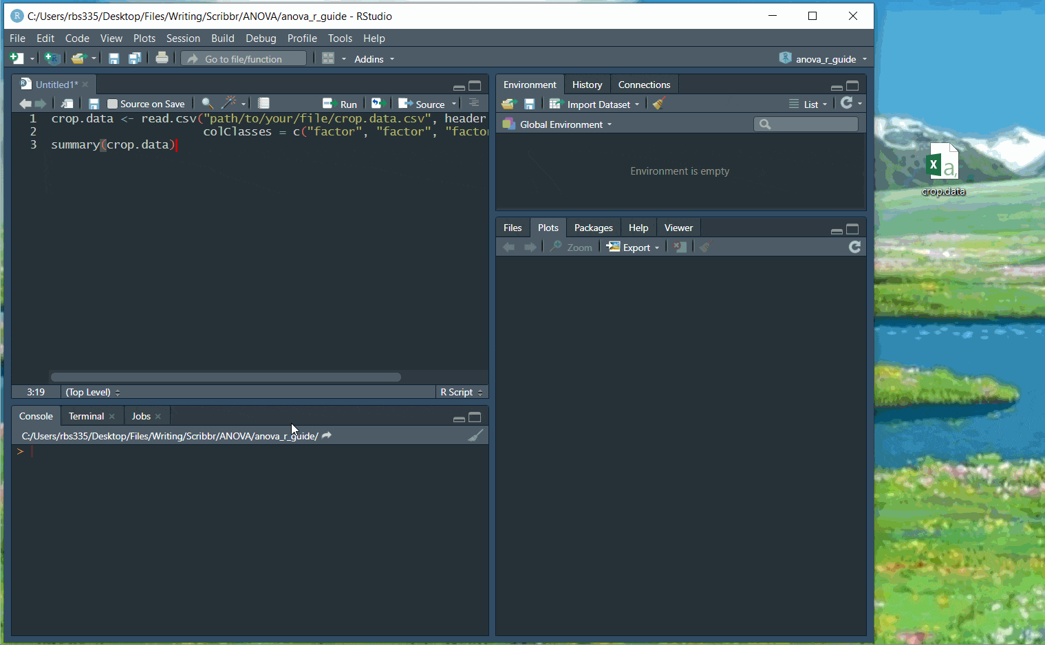
Before continuing, you can check that the data has read in correctly:
summary(crop.data)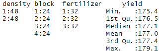
You should see ‘density’, ‘block’, and ‘fertilizer’ listed as categorical variables with the number of observations at each level (i.e. 48 observations at density 1 and 48 observations at density 2).
‘Yield’ should be a quantitative variable with a numeric summary (minimum, median, mean, maximum).
Step 2: Perform the ANOVA test
ANOVA tests whether any of the group means are different from the overall mean of the data by checking the variance of each individual group against the overall variance of the data. If one or more groups falls outside the range of variation predicted by the null hypothesis (all group means are equal), then the test is statistically significant.
We can perform an ANOVA in R using the aov() function. This will calculate the test statistic for ANOVA and determine whether there is significant variation among the groups formed by the levels of the independent variable.
One-way ANOVA
In the one-way ANOVA example, we are modeling crop yield as a function of the type of fertilizer used. First we will use aov() to run the model, then we will use summary() to print the summary of the model.
one.way <- aov(yield ~ fertilizer, data = crop.data)

summary(one.way)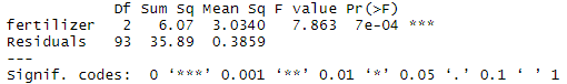
The model summary first lists the independent variables being tested in the model (in this case we have only one, ‘fertilizer’) and the model residuals (‘Residual’). All of the variation that is not explained by the independent variables is called residual variance.
The rest of the values in the output table describe the independent variable and the residuals:
- The Df column displays the degrees of freedom for the independent variable (the number of levels in the variable minus 1), and the degrees of freedom for the residuals (the total number of observations minus one and minus the number of levels in the independent variables).
- The Sum Sq column displays the sum of squares (a.k.a. the total variation between the group means and the overall mean).
- The Mean Sq column is the mean of the sum of squares, calculated by dividing the sum of squares by the degrees of freedom for each parameter.
- The F value column is the test statistic from the F test. This is the mean square of each independent variable divided by the mean square of the residuals. The larger the F value, the more likely it is that the variation caused by the independent variable is real and not due to chance.
- The Pr(>F) column is the p value of the F statistic. This shows how likely it is that the F value calculated from the test would have occurred if the null hypothesis of no difference among group means were true.
The p value of the fertilizer variable is low (p < 0.001), so it appears that the type of fertilizer used has a real impact on the final crop yield.
Two-way ANOVA
In the two-way ANOVA example, we are modeling crop yield as a function of type of fertilizer and planting density. First we use aov() to run the model, then we use summary() to print the summary of the model.
two.way <- aov(yield ~ fertilizer + density, data = crop.data)

summary(two.way)
Adding planting density to the model seems to have made the model better: it reduced the residual variance (the residual sum of squares went from 35.89 to 30.765), and both planting density and fertilizer are statistically significant (p-values < 0.001).
Adding interactions between variables
Sometimes you have reason to think that two of your independent variables have an interaction effect rather than an additive effect.
For example, in our crop yield experiment, it is possible that planting density affects the plants’ ability to take up fertilizer. This might influence the effect of fertilizer type in a way that isn’t accounted for in the two-way model.
To test whether two variables have an interaction effect in ANOVA, simply use an asterisk instead of a plus-sign in the model:
interaction <- aov(yield ~ fertilizer*density, data = crop.data)

summary(interaction)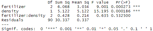
In the output table, the ‘fertilizer:density’ variable has a low sum-of-squares value and a high p value, which means there is not much variation that can be explained by the interaction between fertilizer and planting density.
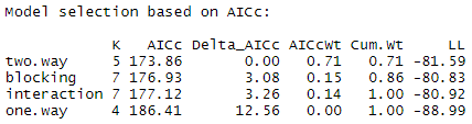
Adding a blocking variable
If you have grouped your experimental treatments in some way, or if you have a confounding variable that might affect the relationship you are interested in testing, you should include that element in the model as a blocking variable. The simplest way to do this is just to add the variable into the model with a ‘+’.
For example, in many crop yield studies, treatments are applied within ‘blocks’ in the field that may differ in soil texture, moisture, sunlight, etc. To control for the effect of differences among planting blocks we add a third term, ‘block’, to our ANOVA.
blocking <- aov(yield ~ fertilizer + density + block, data = crop.data)

summary(blocking)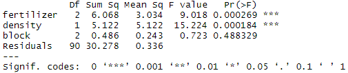
The ‘block’ variable has a low sum-of-squares value (0.486) and a high p value (p = 0.48), so it’s probably not adding much information to the model. It also doesn’t change the sum of squares for the two independent variables, which means that it’s not affecting how much variation in the dependent variable they explain.
Step 3: Find the best-fit model
There are now four different ANOVA models to explain the data. How do you decide which one to use? Usually you’ll want to use the ‘best-fit’ model – the model that best explains the variation in the dependent variable.
The Akaike information criterion (AIC) is a good test for model fit. AIC calculates the information value of each model by balancing the variation explained against the number of parameters used.
In AIC model selection, we compare the information value of each model and choose the one with the lowest AIC value (a lower number means more information explained!)
library(AICcmodavg)

model.set <- list(one.way, two.way, interaction, blocking)
model.names <- c("one.way", "two.way", "interaction", "blocking")

aictab(model.set, modnames = model.names)
The model with the lowest AIC score (listed first in the table) is the best fit for the data:
From these results, it appears that the two.way model is the best fit. The two-way model has the lowest AIC value, and 71% of the AIC weight, which means that it explains 71% of the total variation in the dependent variable that can be explained by the full set of models.
The model with blocking term contains an additional 15% of the AIC weight, but because it is more than 2 delta-AIC worse than the best model, it probably isn’t good enough to include in your results.
Step 4: Check for homoscedasticity
To check whether the model fits the assumption of homoscedasticity, look at the model diagnostic plots in R using the plot() function:
par(mfrow=c(2,2))
plot(two.way)
par(mfrow=c(1,1))
The output looks like this:
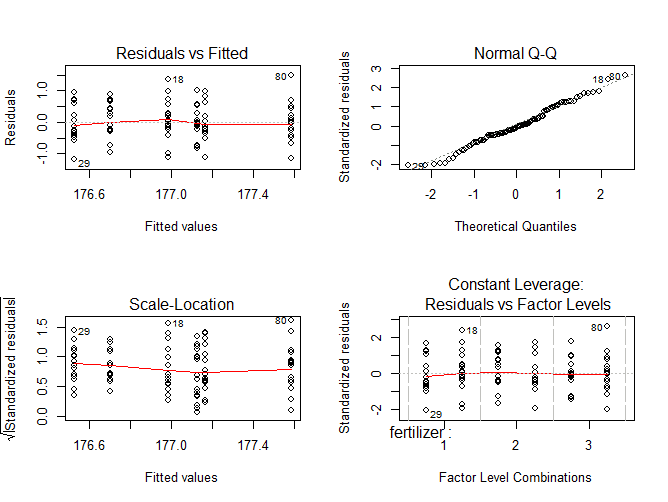
The diagnostic plots show the unexplained variance (residuals) across the range of the observed data.
Each plot gives a specific piece of information about the model fit, but it’s enough to know that the red line representing the mean of the residuals should be horizontal and centered on zero (or on one, in the scale-location plot), meaning that there are no large outliers that would cause research bias in the model.
The normal Q-Q plot plots a regression between the theoretical residuals of a perfectly-homoscedastic model and the actual residuals of your model, so the closer to a slope of 1 this is the better. This Q-Q plot is very close, with only a bit of deviation.
From these diagnostic plots we can say that the model fits the assumption of homoscedasticity.
If your model doesn’t fit the assumption of homoscedasticity, you can try the Kruskall-Wallis test instead.
Step 5: Do a post-hoc test
ANOVA tells us if there are differences among group means, but not what the differences are. To find out which groups are statistically different from one another, you can perform a Tukey’s Honestly Significant Difference (Tukey’s HSD) post-hoc test for pairwise comparisons:
tukey.two.way<-TukeyHSD(two.way)

tukey.two.way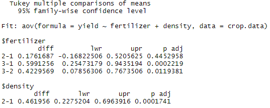
From the post-hoc test results, we see that there are statistically significant differences (p < 0.05) between fertilizer groups 3 and 1 and between fertilizer types 3 and 2, but the difference between fertilizer groups 2 and 1 is not statistically significant. There is also a significant difference between the two different levels of planting density.
Step 6: Plot the results in a graph
When plotting the results of a model, it is important to display:
- the raw data
- summary information, usually the mean and standard error of each group being compared
- letters or symbols above each group being compared to indicate the groupwise differences.
Find the groupwise differences
From the ANOVA test we know that both planting density and fertilizer type are significant variables. To display this information on a graph, we need to show which of the combinations of fertilizer type + planting density are statistically different from one another.
To do this, we can run another ANOVA + TukeyHSD test, this time using the interaction of fertilizer and planting density. We aren’t doing this to find out if the interaction term is significant (we already know it’s not), but rather to find out which group means are statistically different from one another so we can add this information to the graph.
tukey.plot.aov<-aov(yield ~ fertilizer:density, data=crop.data)Instead of printing the TukeyHSD results in a table, we’ll do it in a graph.
tukey.plot.test<-TukeyHSD(tukey.plot.aov)
plot(tukey.plot.test, las = 1)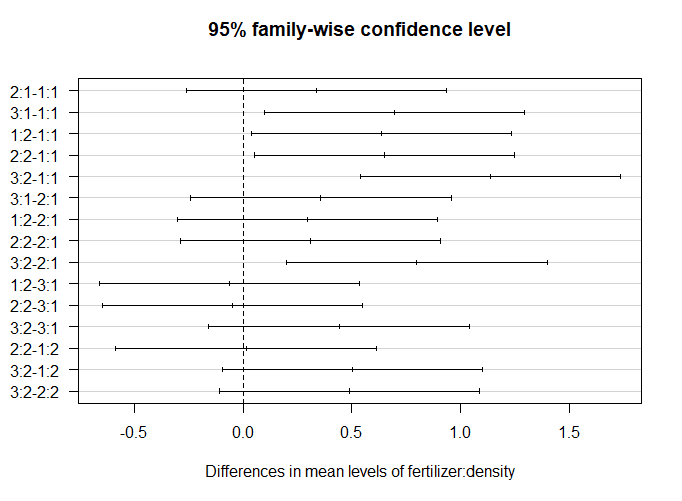
The significant groupwise differences are any where the 95% confidence interval doesn’t include zero. This is another way of saying that the p value for these pairwise differences is < 0.05.
From this graph, we can see that the fertilizer + planting density combinations which are significantly different from one another are 3:1-1:1 (read as “fertilizer type three + planting density 1 contrasted with fertilizer type 1 + planting density type 1”), 1:2-1:1, 2:2-1:1, 3:2-1:1, and 3:2-2:1.
We can make three labels for our graph: A (representing 1:1), B (representing all the intermediate combinations), and C (representing 3:2).
Make a data frame with the group labels
Now we need to make an additional data frame so we can add these groupwise differences to our graph.
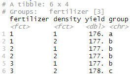
First, summarize the original data using fertilizer type and planting density as grouping variables.
mean.yield.data <- crop.data %>%
  group_by(fertilizer, density) %>%
  summarise(
      yield = mean(yield)
  )
Next, add the group labels as a new variable in the data frame.
mean.yield.data$group <- c("a","b","b","b","b","c")

mean.yield.data
Your data frame should look like this:
Now we are ready to start making the plot for our report.
Plot the raw data
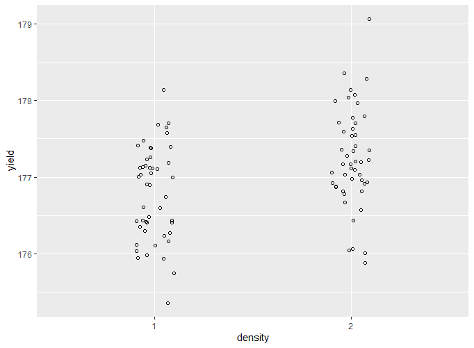
two.way.plot <- ggplot(crop.data, aes(x = density, y = yield, group=fertilizer)) +
  geom_point(cex = 1.5, pch = 1.0,position = position_jitter(w = 0.1, h = 0))

two.way.plot
The output looks like this:
Add the means and standard errors to the graph
two.way.plot <- two.way.plot +
  stat_summary(fun.data = 'mean_se', geom = 'errorbar', width = 0.2) +
  stat_summary(fun.data = 'mean_se', geom = 'pointrange') +
  geom_point(data=mean.yield.data, aes(x=density, y=yield))

two.way.plot
The output looks like this:
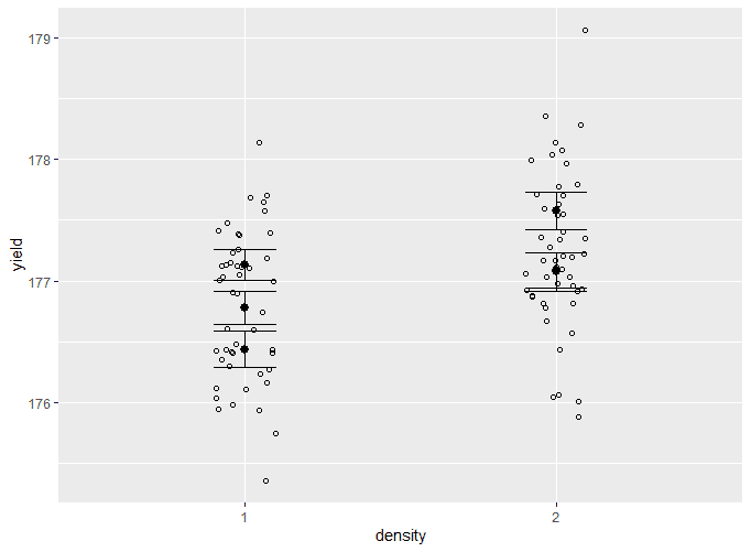
This is very hard to read, since all of the different groupings for fertilizer type are stacked on top of one another. We will solve this in the next step.
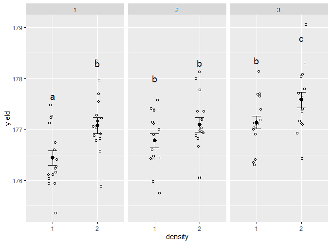
Split up the data
To show which groups are different from one another, use facet_wrap() to split the data up over the three types of fertilizer. To add labels, use geom_text(), and add the group letters from the mean.yield.data dataframe you made earlier.
two.way.plot <- two.way.plot +
  geom_text(data=mean.yield.data, label=mean.yield.data$group, vjust = -8, size = 5) +
  facet_wrap(~ fertilizer)

two.way.plot
The output looks like this:
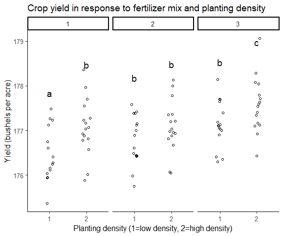
Make the graph ready for publication
In this step we will remove the grey background and add axis labels.
two.way.plot <- two.way.plot +
  theme_classic2() +
  labs(title = "Crop yield in response to fertilizer mix and planting density",
      x = "Planting density (1=low density, 2=high density)",
      y = "Yield (bushels per acre)")

two.way.plot
The final version of your graph looks like this:
Step 7: Report the results
In addition to a graph, it’s important to state the results of the ANOVA test. Include:
- A brief description of the variables you tested
- The F value, degrees of freedom, and p values for each independent variable
- What the results mean.
A Tukey post-hoc test revealed that fertilizer mix 3 resulted in a higher yield on average than fertilizer mix 1 (0.59 bushels/acre), and a higher yield on average than fertilizer mix 2 (0.42 bushels/acre). Planting density was also significant, with planting density 2 resulting in an higher yield on average of 0.46 bushels/acre over planting density 1.
A subsequent groupwise comparison showed the strongest yield gains at planting density 2, fertilizer mix 3, suggesting that this mix of treatments was most advantageous for crop growth under our experimental conditions.
Other interesting articles
If you want to know more about statistics, methodology, or research bias, make sure to check out some of our other articles with explanations and examples.
Statistics
Methodology
Frequently asked questions about ANOVA
Cite this Scribbr article
If you want to cite this source, you can copy and paste the citation or click the “Cite this Scribbr article” button to automatically add the citation to our free Citation Generator.
Bevans, R. (2023, June 22). ANOVA in R | A Complete Step-by-Step Guide with Examples. Scribbr. Retrieved July 9, 2026, from https://www.scribbr.com/statistics/anova-in-r/
